Recovery, designed to feel welcoming.
Logo, website and print for MI Rehab - a physiotherapy centre in the USA that wanted patients to feel at ease from the very first click.
( THE STORY )
A clinic people trust before they walk in.
MI Rehab is a physiotherapy centre in the United States. Patients often arrive in pain, anxious and comparing options online.
The brief: a clean, caring identity, a website that explains each therapy in plain language, and print fliers the team could hand out locally - all speaking the same visual language.
Calm colours, clear words and one obvious next step - that is what a patient in pain needs.
( THE IDENTITY )
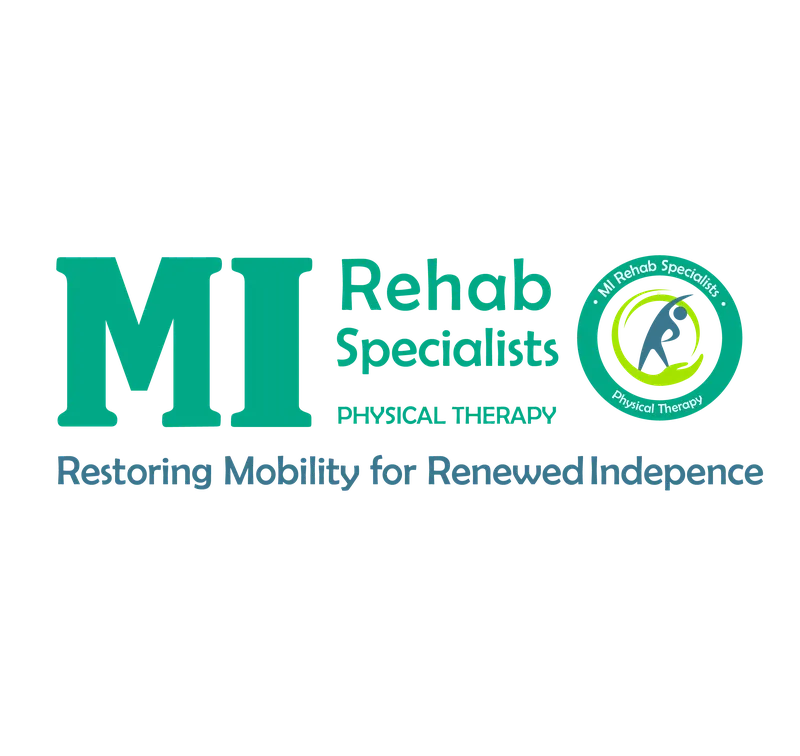
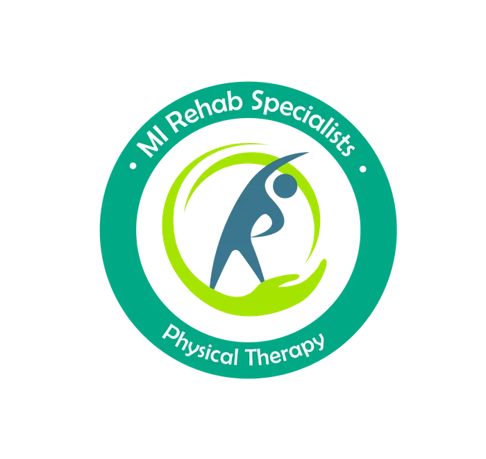
A mark that feels like care.
Two lock-ups - a stacked mark for social and signage, and a horizontal version for the website and print.
( THE WEBSITE )
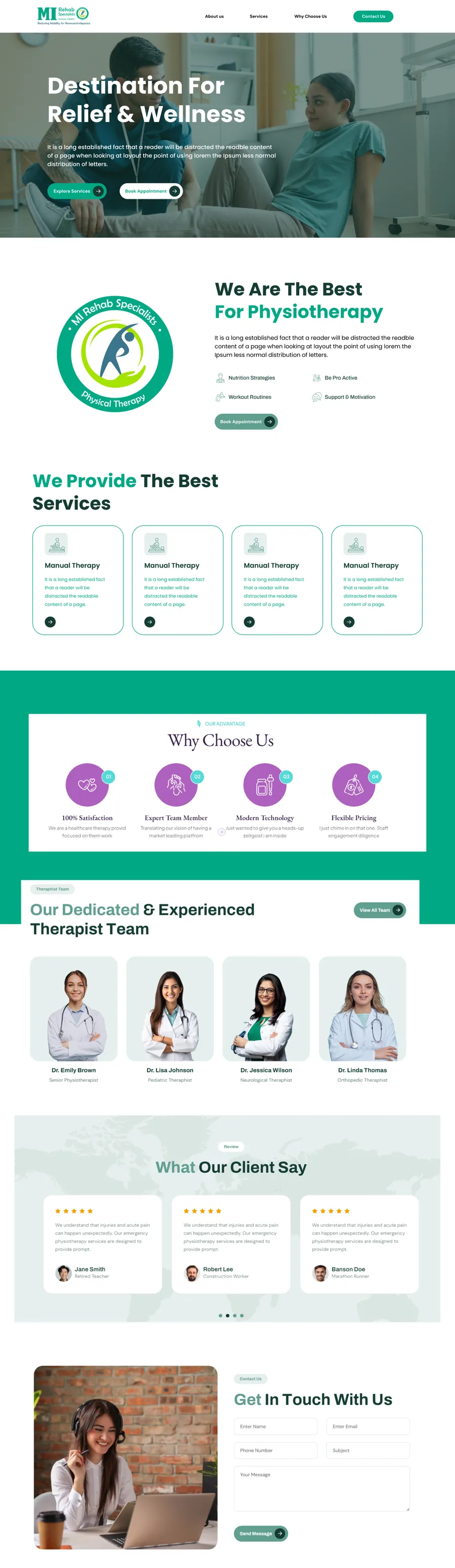
Every therapy, explained simply.
The physiotherapy page walks patients from symptoms to treatment to booking - no jargon, no dead ends.
( IN PRINT )
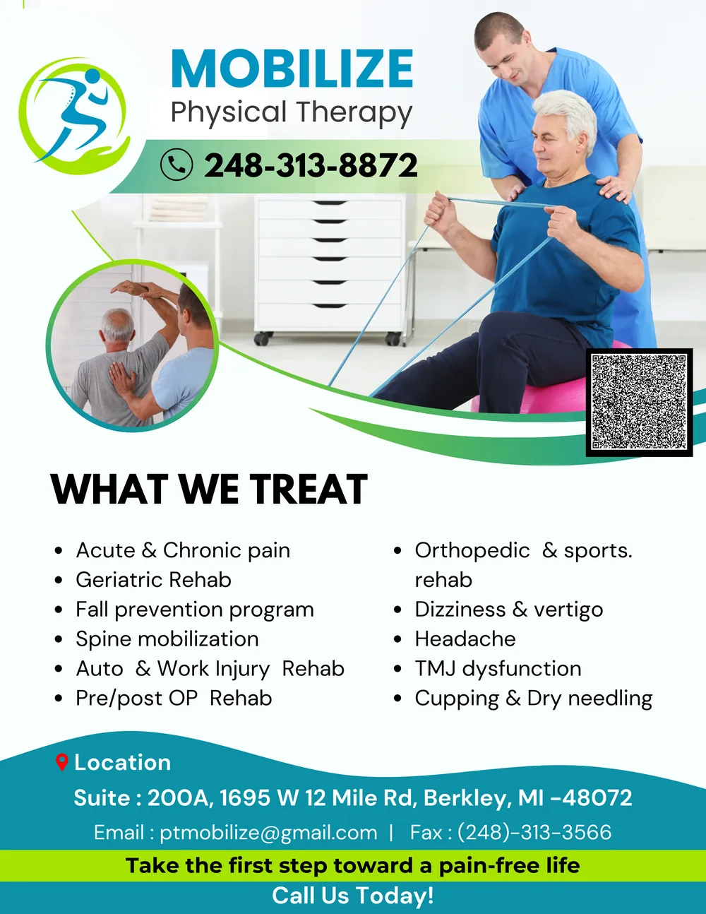
Made for the front desk, too.
Fliers carry the same colours, type and tone as the website, so a patient who picks one up recognises the clinic instantly online.
( WHAT WE DID )
One identity, from screen to paper.
- 01
Logo & identity
A confident mark with stacked and horizontal versions for every placement.
- 02
Website
Therapy pages written for patients, with clear calls to book an appointment.
- 03
Print fliers
Address-ready fliers for local outreach, matched to the website.
( THE OUTCOME )
A clinic that looks as good as it treats.
- One consistent identity across logo, website and print.
- Therapy pages written for patients, each ending in a clear next step.
- Print-ready fliers that match the website for local outreach.
( YOUR TURN )
Want results like this?
Running a clinic or practice? We design the identity, website and print that help patients choose you with confidence.